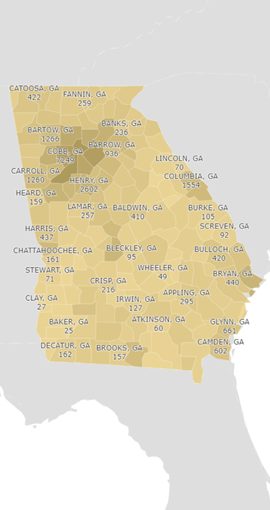


Georgia 811 provides members free access to ThoughtSpot, a software platform that provides detailed member data on tickets and response information. Information is presented in three distinct pinboards (dashboards) in a variety of tables and visualizations that allow members to easily investigate their ticket data.
Access to your ThoughtSpot data can be requested by filling out the form below.

ThoughtSpot uses unique terminologies that you will see referenced when using the software.
Answers are Charts, Tables, or other visualizations of your data.
Pinboards are dashboards that you can pin and unpin, rearrange, and resize your charts, tables, and other Answers.
Searching is how you start creating an answer. You search your data and save the result as an Answer.
Now that you understand these terms, you can continue reading to see how to Drill Down, use Interactive Labels, Download data, and Explore your data.
Each Answer (data visualization/graph) can be thought of as a starting point for your data. For instance, in the Ticket Totals Monthly answer (see table below), your starting point is the total number of unique tickets for your billing code for the months displayed on the graph.
If you want to see how many tickets of each ticket type were received in each month, you can drill down into that month by ticket type. To do so, follow these instructions:
At this point if you want to reset the graph to the initial view, click the blue circle with the arrow in the bottom of the right of the graph. You can also drill down further if you like by right clicking a ticket type value on the resulting chart, selecting Drill down again, and searching for and selecting the data item that you want to further investigate (for instance, Excavator Type).

You can download any Answer that is a graph, chart, or visualization as an image (PNG). You can also download Answers that are tables, such as the Ticket Insights table on the Member Overview pinboard in Excel (XLSX), Acrobat (PDF), or Comma Separated Values (CSV) formats.
Many of the visualizations in Thoughtspot have interactive labels. On pie charts, for instance, clicking on a label will slide out the pie piece that that label represents so you can see that slice better. For Bar or Column charts, clicking on a label can remove or add back in that labelled data item.
For charts like Emergency Notifications by Hour Last 30 Days, you can remove days from the chart by clicking them. For instance, if you click on Saturday and Sunday, you will see the chart show the emergency notifications by hour for only weekdays (Saturday and Sunday will not be reflected in the chart). To add them back in, click on those labels again.
Exploring is a useful tool to see different aspects of your data. For instance, you can look at the Ticket Totals Monthly and exclude emergency tickets or add in the Day Of Week. When exploring data, you can Filter, Add, Replace, and Compare.
To start exploring:
Next, select the operation you’d like to do with the data:
Filter – exclude some subset of data from the Answer
Add – add additional data to the Answer
Replace – Replace one data item with another
Compare – Select a data item to compare, and then select two values of that data item to see them side by side.